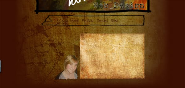
ok, a lot of tweeking here and there has been done to get what I have at the moment, I have made the background darker with a nice texture, I have also included an image of myelf (which I hated doing) but I think it will enefit from having an image of me on there - makes it more personal.
I think I have an obsession with texture that is like old coffee stained paper - no idea why. I have included a box textured like this for my introduction to the site. At first it was too light so I darkened it down a bit to better suite the overall design of the page. I then wanted to write on it myself to keep it more personal but as my skills with the digital pen leave a lot to be desired (it looked like a 5 year old had wrote it) I opted to use the font that is in the header which will help keep a little consistancy.
I'm really liking it at the mo - what do you think?
Wednesday, 21 April 2010
Tuesday, 20 April 2010
Development of design
I have made the design darker and used a better texture - i'm linking it! Due to some feedback I was given i'm going to play around with the font of "web design" in the header.
Sunday, 18 April 2010
My Portfolio Website
Its about time that I start to think about getting my own portfolio website up and running now that I have bought my own webspace (www.skirky.co.uk) and I am starting to produce work that I am happy to display online. I am starting to put together some designs for this. My first is concentrated around my favourite colour brown and other objects that I use when designing such as pencil and paper - keep it simple, keep it clean. I want to get across a kind of sketchy feel which displays my thought process and my design process.
This is what I have so far which I am really happy with. Hopefully this will develop onto even better design ideas for my website.
In this I am keeping a consistant colour (although I might still play around with the tone of that background brown) Within the header I have used my own hand to write my name instead of a font, which keeps it personal, on top of a graded image of one of my own paintings.
This is what I have so far which I am really happy with. Hopefully this will develop onto even better design ideas for my website.
In this I am keeping a consistant colour (although I might still play around with the tone of that background brown) Within the header I have used my own hand to write my name instead of a font, which keeps it personal, on top of a graded image of one of my own paintings.
Friday, 16 April 2010
Lambley Riding Club - Group Project
From this post any work related items will be posted onto our group blogger:
http://lambleyridingclubwebsite.blogspot.com/
Friday, 19 March 2010
PHP login and News Feed
I have included a PHP news feed for the About section of the website so that the client can regularly post what he is up to with his photography. There are just a few bugs to work out but it works really well.
This is accessed via a link in the index page called "Admin"
The user logs in with account details that are stored in the myadminphp database.
Here they can see older posts and type up a new post for the website.
The posts are displayed in the 'About' section in the style of a newspaper.
I would like to develop this so that there is a Delete and Edit function on the posts for the client and I would look at displaying the posts a little differently to make it look more like a newspaper.
This is accessed via a link in the index page called "Admin"
The user logs in with account details that are stored in the myadminphp database.
Here they can see older posts and type up a new post for the website.
The posts are displayed in the 'About' section in the style of a newspaper.
I would like to develop this so that there is a Delete and Edit function on the posts for the client and I would look at displaying the posts a little differently to make it look more like a newspaper.
Tuesday, 9 March 2010
About me Page
After quite a while of aligning the image left and then to the right and then back to the left over and over again I FINALLY decided on the right : )
So here is the About page with a nice little flash element to the page title too (the letters move and change colour slightly on mouse over)
Monday, 8 March 2010
Image Galleries
Finished all the flash image galleries, they look great. There is an image gallery for every category, this is how they look.
Tuesday, 2 March 2010
SWF file background sorted
This is what my swf file looked like when I inserted it into my html document, howerver I need the background to be transparent.
Daryl helped me with this just now and i've sorted it
Development of Website
I have placed my navigation bar and logo and also added the twitter button to it also which will link to the client's twitter page.
Subscribe to:
Posts (Atom)


