
Have settled on a topic question:
What does it mean to create a portfolio and what are the circumstances that necessitate their creation?
I have already found some interesting literature on this topic so I'm collecting all the useful information I can find.
Saturday, 30 October 2010

Sam Taylor-Wood
In the midst of gathering materials for my PRP topic I, for some reason, started thinking about some of my favourite artists. One of these is Sam Taylor-Wood, I was lucky enough, to quite by accident, find myself walking around an exhibition of photographs by her whilst in Wellington, New Zealand. The exhibition, in the waterside gallery, was of her series of 'Crying Men' I thought they were fantastic.

What is also interesting about this artist is that she is bringing her work and her style of work into the bracket of Multimedia. She started out specialising in art photography and went on to produce various pieces of film. I just think that she is a good example of an artist utilising technology today to move their work forward.

She was asked my Elton John to make the music video for his song "I Want Love". The making of this video introduced her to the fast pace of the video production world.
Here is the video:
http://www.youtube.com/watch?v=ufbexgPyeJQ&ob=av2n

This video led to other pieces of work between Sam Taylor-Wood and Robert DJ.
The Pietr:
http://www.youtube.com/watch?v=v4PjMuIhwdA

She has also created work in video that is mostly done with paint; Still life:
http://www.youtube.com/watch?v=MIzXWGcb3u0&feature=related
With regards to Web Portfolios, I was unable to find a dedicated website for Sam Taylor Wood, all that I found were exhibition websites etc. I thought this was quite interesting as in these times it is said to be essential for creatives to have an online portfolio or online presence. This led me to think that perhaps for well established artists, it is un-necessary to have an online portfolio?
An interesting video interview can be found here:
http://channel.tate.org.uk/media/25818491001

What is also interesting about this artist is that she is bringing her work and her style of work into the bracket of Multimedia. She started out specialising in art photography and went on to produce various pieces of film. I just think that she is a good example of an artist utilising technology today to move their work forward.
She was asked my Elton John to make the music video for his song "I Want Love". The making of this video introduced her to the fast pace of the video production world.
Here is the video:
http://www.youtube.com/watch?v=ufbexgPyeJQ&ob=av2n

This video led to other pieces of work between Sam Taylor-Wood and Robert DJ.
The Pietr:
http://www.youtube.com/watch?v=v4PjMuIhwdA

She has also created work in video that is mostly done with paint; Still life:
http://www.youtube.com/watch?v=MIzXWGcb3u0&feature=related
With regards to Web Portfolios, I was unable to find a dedicated website for Sam Taylor Wood, all that I found were exhibition websites etc. I thought this was quite interesting as in these times it is said to be essential for creatives to have an online portfolio or online presence. This led me to think that perhaps for well established artists, it is un-necessary to have an online portfolio?
An interesting video interview can be found here:
http://channel.tate.org.uk/media/25818491001
Saturday, 23 October 2010
Development of design
The Parents Section
I have started to develop the parents section of the website, the purpose of this section is so that parents can learn about digital piracy as well as their children, after all their sons or daughters are probably using the household computers and Internet connection to download their software. I feel it is important that they are also informed as to how to download and file share safely and legally.
The idea behind the design of the page was to make it feel light and clear, giving the impression that everything is calm, not scary, and it all clear and easy to understand. It was also important that I keep a consistency within website as a whole.
Therefore I have kept the cityscape at the top of the page but changed the scene to being a day time view of the city:
 Still plenty to do but I feel its coming along nicely.
I have started to develop the parents section of the website, the purpose of this section is so that parents can learn about digital piracy as well as their children, after all their sons or daughters are probably using the household computers and Internet connection to download their software. I feel it is important that they are also informed as to how to download and file share safely and legally.
The idea behind the design of the page was to make it feel light and clear, giving the impression that everything is calm, not scary, and it all clear and easy to understand. It was also important that I keep a consistency within website as a whole.
Therefore I have kept the cityscape at the top of the page but changed the scene to being a day time view of the city:

Thursday, 21 October 2010
Advise for Parents
I managed to find the PDF that convinced me to add an 'Advise for Parents' section to my website:
http://www.pro-music.org/content/library/pdf-youngpeople-english.pdf

It is provided by Childnet and has a style that I like, I think it is fun and friendly and looks like it has something to do with children whilst not looking too childish. I like the use of colour in it, bold and easy to read.
I will try to use this style when making my parents section.
http://www.pro-music.org/content/library/pdf-youngpeople-english.pdf

It is provided by Childnet and has a style that I like, I think it is fun and friendly and looks like it has something to do with children whilst not looking too childish. I like the use of colour in it, bold and easy to read.
I will try to use this style when making my parents section.
Monday, 18 October 2010
Something Missing..?
I had a feeling that something was missing from the design of the page. I was on the train heading home for the weekend and I was looking out at all the buildings and old warehouses on the outskirts of each town we went through. I was looking at the texture of what was in front of me, cement, brick, corrugated iron they all made the buildings and streets so much more interesting to look at. That's when I realised that my design was missing a bit of texture. After playing around with a few different things I decided to keep it simple, so the page didn't become too busy, and use a light brickwork pattern on the background of the content area.
I am really pleased with how this now looks so I can concentrate on more on coding the site.

I am really pleased with how this now looks so I can concentrate on more on coding the site.

Wednesday, 13 October 2010
Development of design
I have added a footer to the web page, I think it adds to that grunge/city look, I think it also helps to balance out the page.


Tuesday, 12 October 2010
Neon Sign Development
I have created the skull and text images in an 'on' and an 'off' state, this is preperation for either the javascript image change or the flash animation which I have decided to get to work on mouse over to make the site a little more interactive.


3D Buildings
Due to some more feedback I have made the buildings at the top 3D which I think sets the image off quite nice. I have also gotten rid of the back of the sign and will make the "Digital Piracy" text part of the sign so they will both flicker. I also tried adding a moon but didnt like the way it looked.

Development of design

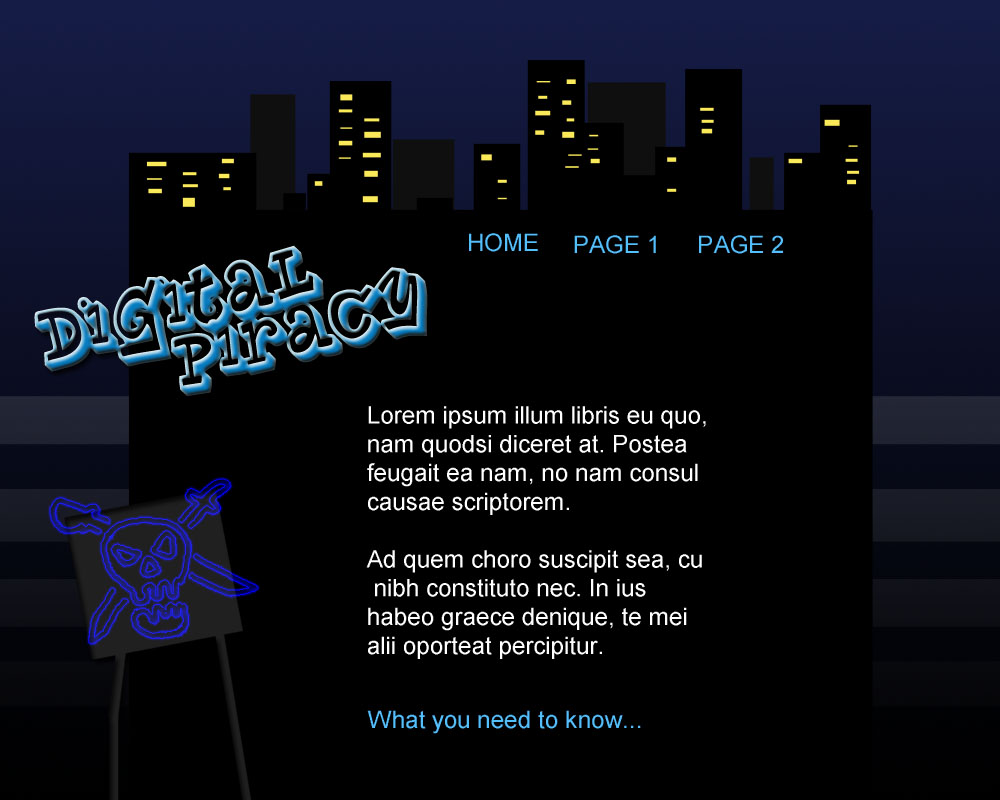

Some of the things they pointed out was that this design was better for my target audience (11-16 year old) with its grunge/city style. I was advised by my tutor and peers to create some more depth on the page, it was suggested that I do this with a simple gradient - blue to black which I have done and it really brings out the cityscape. I have also added a few stars which add a little bit extra to the overall image of the page.
I intend to make the lights in the buildings change a little and the perhaps the stars to twinkle slightly, I will try to do this with a JavaScript image change or failing that I will use flash. I also want to make the pirate sign less obvious at first but to make it act like a faulty neon sign, so it will light up off and on as if it is broken. I also need to make the back of the sign less obvious.
Sunday, 10 October 2010
BEN AND JERRY'S WEBSITE
LOVE IT


Everything from start to finish on this site is fun to look at or interact with ENJOY
Subscribe to:
Posts (Atom)


 Posts
Posts

