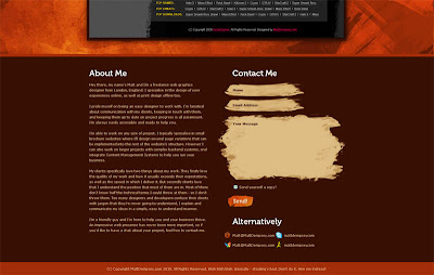
Matt Dempsey's site is very textured so may give the illusion of being crowded but really is very nicely spaced out. It does'nt give the 'aired' feel that you somtimes find on creative practitioner's websites, where everything is white/grey so not to deter the eye from the work. It has a sligtly 'grung' feel about it by the colours and texture used.
The navigation bar compliments the site by mimicing the 'brush stroke effect', my favourite button in the navigation is the little bird which navigates to his Twitter site.
Again the style is consistant thoughout with the 'brush stoke' being used for the boxes on the Contact form.
His Work portfolio page is very simple and clean but looks complicated with the javascript encoperated being a nice touch.
Work
Looking at his work, he detaches himself from the 'busyness' of his own site to create sites that are very clear and crisp, each with great uses of colour and special awareness. He manages to work to his target market in each of the seperate designs and retain the indevidual identities of each company.
His Print work demonstrates his great way of communicating, his designs are all eye catching and clear. It is obvious that Matt is a very good colourist and combines that with his great skill with images.
What would I take from his work?
I aim to keep a consistancy in the designs of my work just like Matt has done with his website and the websites that he has made for others. I would also look at his use of colour with all of his sites as they are all very nicely done. Another thing I would look at is his use of images which are all very eye catching and integrate well into the design of the whole thing. I would also look at some sort of nice transition like the one he has used to go from his web work to his print work, I think it adds a nice touch to the page and encourages people to interact with your site and explore furthur.
What would I not take?
I did'nt like how half of the page was taken up with the About and Contact information, I think it breaks flow of the page. I would probably put them on a seperate page.
Take a look: http://www.mattdempsey.com/


No comments:
Post a Comment